This post is a "blast from the past"—it was originally part of an interview for Kathy Temean's Illustrator Saturday for her Writing and Illustrating blog.
Creating the Croc & the Platypus
The Croc & the Platypus (Walker Books) was released July 2014. Now available in paperback!
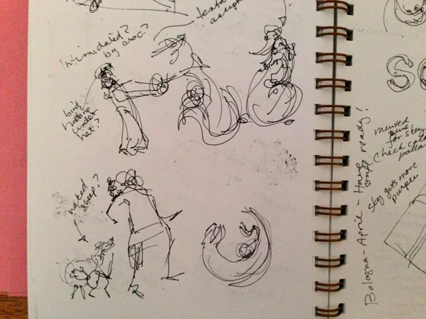
I think the illustrations for most picture books start with an instinctive emotional response to the text. For me it begins with brainstorming, which is a bit like getting your emotional responses down in shorthand form. Occasionally some of the sketches make it directly into the final illustrations
For example, you might be able to recognize the posture of the shearer (a shearer is the fellow who clips the fleece from the sheep) and his sheep from the doodle above in the final illustration below.
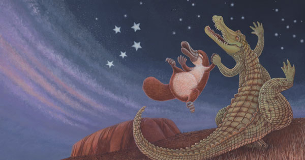
One of my first impressions of The Croc and the Platypus text was that it was ‘joyful’—especially the dance under the stars. So how do a Croc and a Platypus dance joyfully? One evening, while I was cooking dinner, I had a sudden image in my head and rushed into the studio to get it onto paper.
The image was of funny pear shaped characters holding hands and swinging through the air like pendulums. This one image was the genesis for the shape and the personality of the characters.
I developed this a little bit further into these tiny thumbnail sketches. I usually work out the page layout at a very small scale so that I look at the overall flow and I don’t become hung up on detail.
You will see that the image did not change much to the final artwork.
It was important to transform the generic names of Croc and Platypus into characters with personality. To do this I slowly developed a back-story in which they are longtime friends who help each other out without thinking about it consciously. So how do you express this in a picture? Above is the first concept I doodled for the BBQ spread which shows the Platypus lounging by the campfire and using the Croc’s tail as a backrest.
I was happy with this idea so I sketched it up into thumbnail. You can see that I changed the horizon to curving to add more flow and movement and that the Croc tail wraps around the Platypus.
The next step was to go to a more finished rough to my art director at Walker Books. At this stage the feedback was that everyone wanted to see what a fleece tent would look like.
So I unrolled the fleece and erected a tent!
The final stage is Colour Artwork.
So, the process begins with an impressionistic and emotional response that is slowly refined. After the initial burst of intuition and emotion, it is time to engage the analytical brain and make design decisions which hopefully lead to a solution which best communicates your initial reaction.
I suppose every illustrator takes a different approach to creating a picture book. I’m more of a ‘planner’ than a ‘fly-by-the-seat-of–your-pants’ girl—my work is pretty systematic. To illustrate my process, I thought I would take you through the development of one spread from The Croc and the Platypus. This spread had more changes than any other in the entire book. It shows how an image evolves and a little bit of the collaboration with my art director and editor at Walker Books.
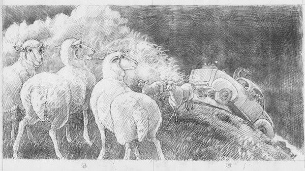
Storyboards are small A4 size (297mm x 210mm) roughs of the entire book and they are the first stage to receive feedback from the publisher. The storyboard above received the comment that it would be good to include sheep or shearers to aid the transition to the following spread. The general storyboard feedback included a comment that it would be good to show the Ute (that’s Aussie slang for a pick up truck) from the distance somewhere in the book. I thought these were very valid points so I incorporated both comments into the revisions for this spread.
You will see that I added some rather bemused sheep watching the Ute bounce over a hill to the Shearer Shed. This Final Rough stage, drawn at the same size as the printed book, goes back to Walker Books for feedback. Luckily, they gave me thumbs up and an OK to go to colour artwork.
This snap of my desk shows the beginning of final art. I’ve enlarged the rough 110% and started to redraw it onto heavy watercolour paper. I chose just a small enlargement because I didn’t want the final image to lose the texture of the pencil lines and brush marks when it was scanned and reduced for print.
I’ve redrawn the image roughly onto the watercolour paper. I do this partly because it sets the values and partly because I wanted some of the line work from the under drawing to show through.
Because the story takes place in the Outback of Australia I wanted a tint of ‘red earth’ to show through so I continued the under painting with a terracotta orange. It can be pretty scary to slap that orange on the first time, but after a while it’s quite therapeutic!
At this point, I have a lot of the colour down but I realise that there is something not working—unfortunately I can’t determine exactly what that is. This is when I use the time-tested method of putting it away in a drawer and moving on to something else!
When I finally unearth the drawing from my map drawer, I realise that it is the dust cloud from the Ute that is not working. It is merging with the low lying clouds and looking like a massive storm. Unfortunately, this involves a total rework of the sky.
The sky here is a work in progress and I discovered that it has shifted the balance with the sheep so they need a total rework as well. It’s a domino effect!
The Final Image as used in the book.
So it was a bit of a bumpy ride with this particular spread, but like the characters in the book, it ended with a happy dance!


